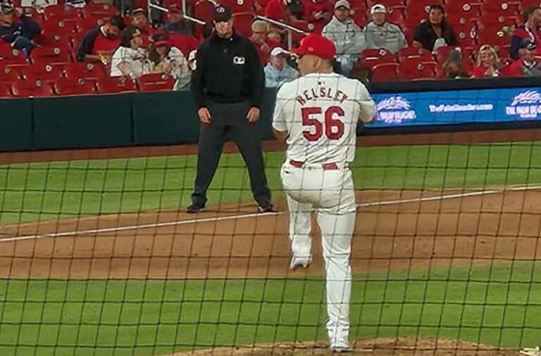
If you have been watching a Cardinals game recently, you may have noticed a slight difference to the uniforms. The letters on the back look smaller, the Major League Baseball logo is more down on the back of the jersey, and they overall just look lower quality. This is due to Nike and Fanatics’ new Vapor Premier uniforms.
The reactions to these new uniforms are mixed, as fans and even players express their concern about the changes made to a previously traditional look. The MLB states that the new jerseys are 25% more flexible and dry 28% faster.
MLB Commissioner Rob Manfred states that the uniforms “have been tested more extensively than any jersey in any sport” and that the players gave their “seal of approval” when the uniforms were tested at last year’s All-Star game.
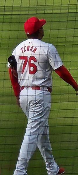
Some of the issues with the new jerseys include the font of the names being too small, the color of some jerseys appearing to not match the color of the pants, pants ripping, and overall they feel cheaply made, there are even complaints of some pants being see-through.
“The names are too small, and the quality is too low,” junior Carson Scrogin said. He is not the only one at Liberty who has critiques about the new uniforms.
Some players on Liberty’s baseball team are also concerned about the lack of quality in these new MLB uniforms. “They made the names on the back of the jerseys look bad,” junior Logan Sproull said. “The gray jerseys don’t match some of the team’s gray pants.”
Fellow Liberty baseball player junior Owen Witte also doesn’t like the new look. “I don’t like them because the letters on the jerseys are small, and the font is worse than before,” Witte said. “I’ve also seen videos of pants ripping when players slide, and that shouldn’t be happening to major league jerseys.”
If you go to a baseball game in the near future, make sure you know that the jerseys might not be the same.


